How To Create A Simple Parallax Style Effect With CSS
July 9, 2020
Adding a parallax style effect to our web page can really make it stand out.
You may have seen this effect when scrolling on web pages or apps.
It basically involves the background, in our case an image, scrolling at a different rate to the rest of the content on top of it.
You can find a working codepen example here:
https://codepen.io/chrisdixon161/pen/VwexxYO
There are many options out there to achieve a similar effect, and many making use of Javascript, but we are going to be doing a simple CSS only version.
How? Let's take a look.
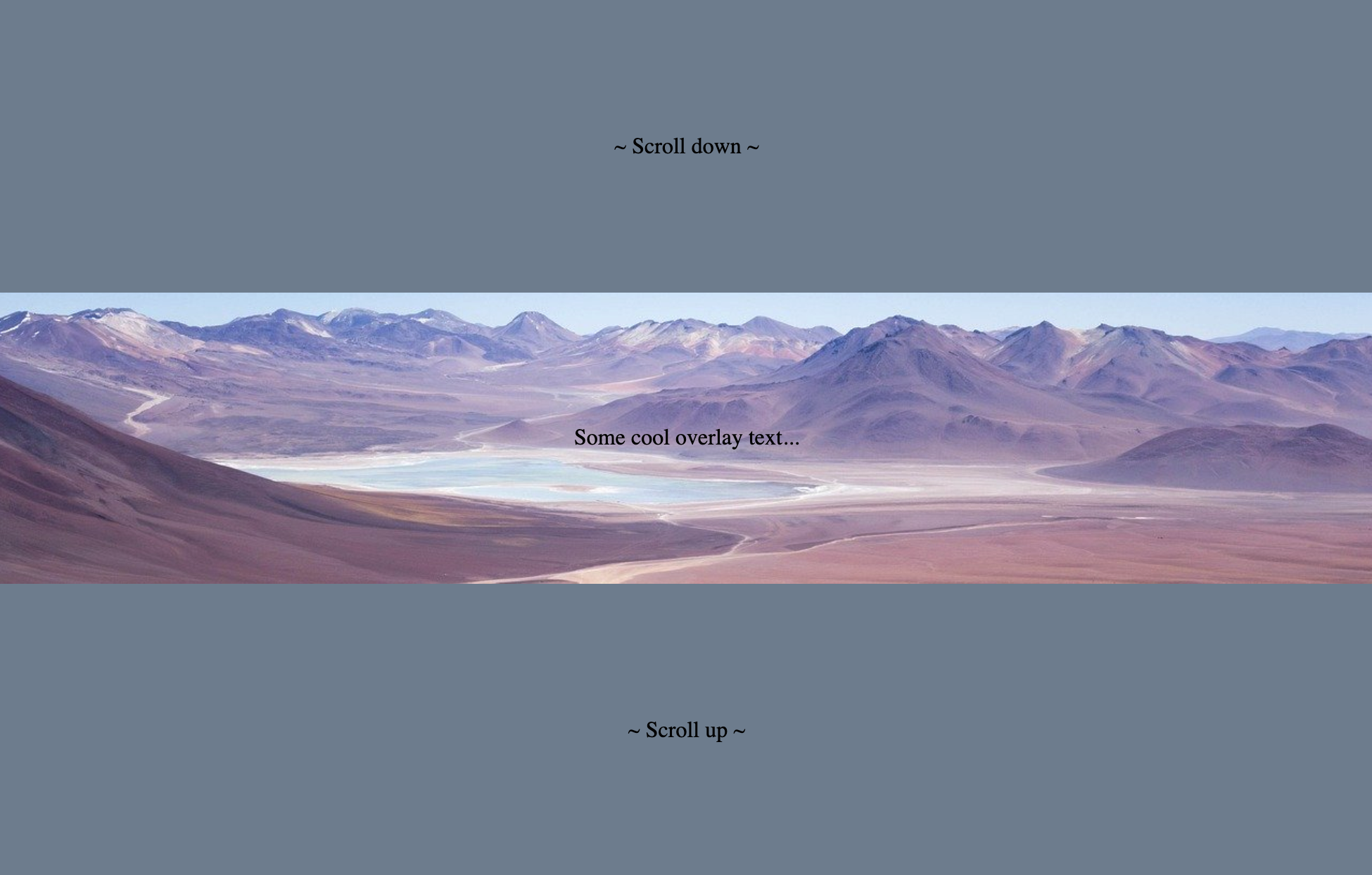
First, we need some HTML content:
<section class="top">
  <p>
~ Scroll down ~
  </p>
</section>

<section class="parallax">
  <p>Some cool overlay text...</p>
</section>

<section class="bottom">
  <p>
~ Scroll up ~
  </p>
</section>
This will give us 3 sections, a top and bottom which is our "regular" content. And a middle section which contains the image.
Now onto the CSS, to begin, this will just be some simple styling not related to the parallax:
.top, .bottom {
  background: lightslategray;
  height: 100vh;
}


section {
/*  align text  */
  display: flex;
  justify-content: center;
  align-items: center;
}
This will give a gray background to the top and bottom sections, and these sections will appear to move over the middle section soon.
For the parallax to work, we need to add a background image to scroll over:
.parallax {
  /* set image for background   */
  background-image: url('https://res.cloudinary.com/djn1ticju/image/upload/v1594285691/parallax-background.jpg');

/*  full height image  */
  height: 100vh;

/*  image starting position- eg. top, right, left, bottom  */
  background-position: center;

/*  size of image, eg- 50%, 3rem, 500px etc.
    cover= scales the image as large as possible without stretching
  */
  background-size: cover;
}
This will leave us with a pretty regular website with 3 sections, all scrolling together:
To get the desired effect, the key part is to set this background image to be fixed
.parallax {
  /*... at to rest of code in this .parallax selector: */

/*  To get the desired effect, the key part is to set this background image to be fixed  */
  background-attachment: fixed;
}
Now try to scroll in the browser and see the effect!